Childrens Hospital
Children’s Hospital
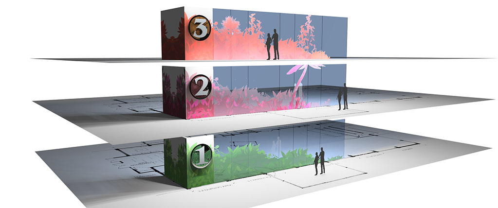
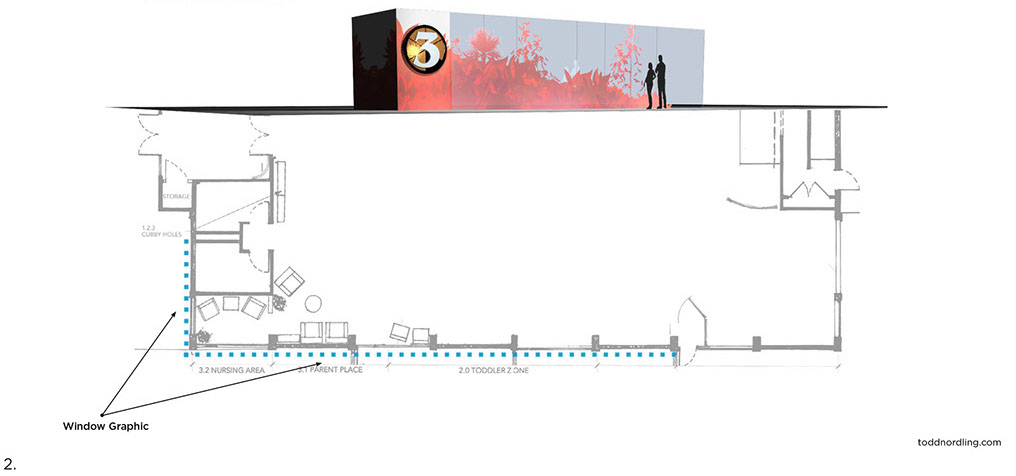
The Seattle Children’s Hospital wayfinding and graphics program eases navigation through a growing campus while offering an ongoing source of serenity and imagination. The primary goal was to create a casual environment where visitors feel at ease in a welcoming and caring environment.
“To escape for a moment in what can be a distressing hospital environment is priceless. The use of immersive graphic landmarks and symbology creates a ubiquitous graphic language and memorable way for users of all ages and backgrounds to navigate an often-unfamiliar environment.”
Children’s Hospital
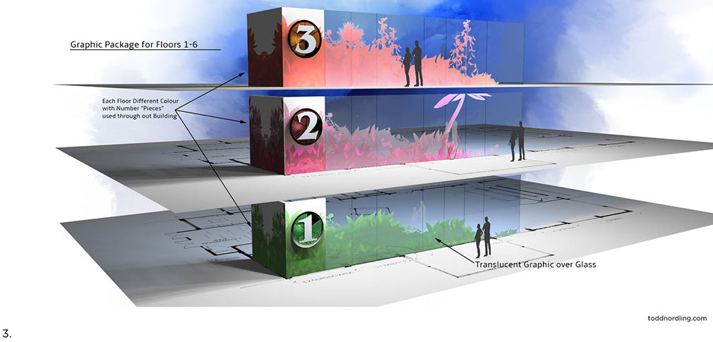
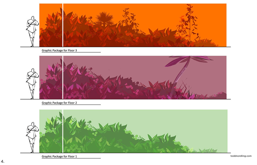
Upon entering this healthcare facility patients can readily recognize all the local plants and animals on the murals. Wayfinding is made easy inside the clinic by color-coded hallways and patient corridors. This Seattle Children’s clinic serves kids of all ages between 0-21 with a wide range of cultural backgrounds. The murals and the colorful surroundings also help the hospital clinic staff: their work is easier done in a beautiful environment, and the strategically illustrated art pieces help them to do their procedures efficiently.
Children’s Hospital
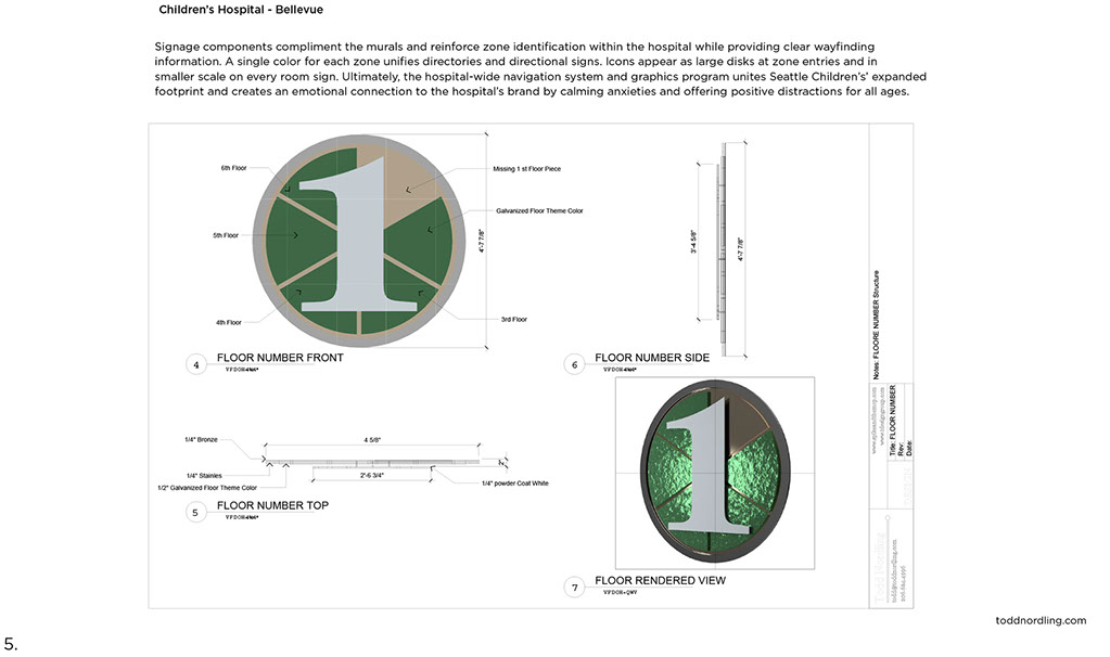
Signage components compliment the murals and reinforce zone identification within the hospital while providing clear wayfinding information. A single color for each zone unifies directories and directional signs. Icons appear as large disks at zone entries and in smaller scale on every room sign. Ultimately, the hospital-wide navigation system and graphics program unites Seattle Children’s’ expanded footprint and creates an emotional connection to the hospital’s brand by calming anxieties and offering positive distractions for all ages.
Seattle Children’s
Virtrine Display Cases
The display cases are 4 fully transparent glass cases embedded in the windows of Building Cure along Terry Ave. They are installed in front of a 90’ x 15’ mural painting (permanent installation). They are designed to be regularly refreshed.
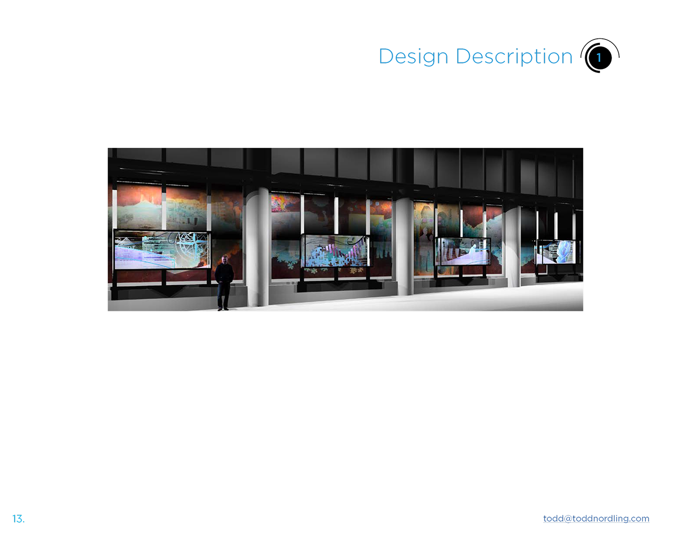
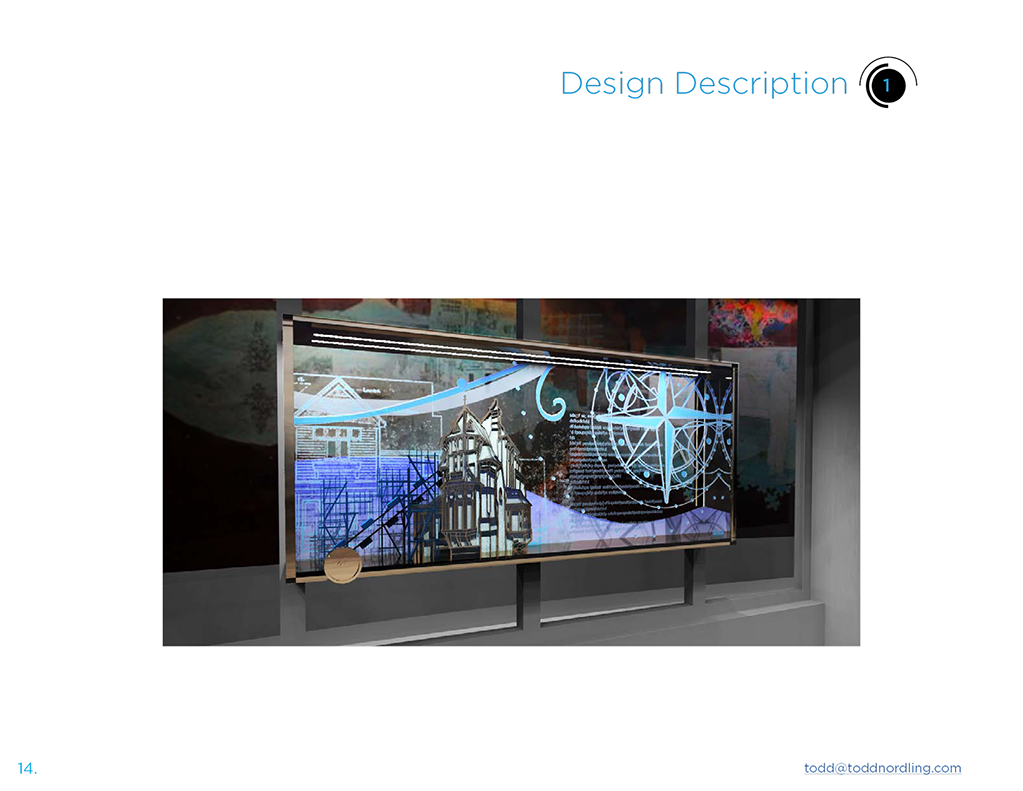
Each display’s design echoes the mural behind it in a way that compliments and enhances the viewer’s ability to interpret the mural and also to dive more deeply into the important content about the featured groups celebrated here by Seattle Children’s Research Institute.
Materials in the first display that features Project and Construction Teams, inline with the mural behind it, contains profile cut brass and acyrilic and an interactive mechanical crank that moves elements inside the case. Depending upon the artifacts or photos selected to represent this
group, these could be moving as the viewer cranks the crank. The mechanical crank conveys kinesthetically the building up, both physically and metaphorically, of those who came before to make SCRI what it is today.
The mural will be visible through the cases at a transparency percentage that makes the most sense in the context of the whole experience, and the case interpretation will be accessible from both sides. Interaction between visitors on the inside and outside could be developed to promote connection, the visitoron the inside affecting a change in the visual for the visitor outside and vice versa. The design will also allow the content to be refreshed in the future. Similar to the mural the displays read from left to right and could show how Seattle Children’s Research Institute has evolved over time, while still retaining a thematic presentation that need not be read in any order. Displays can be approached randomly and each can tell a full story independent of having seen the other displays, while cumulatively, from left to right, they tell a full linear story.
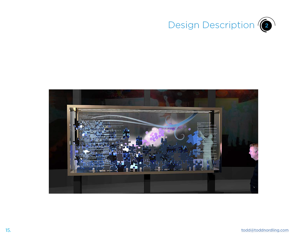
The second display case features the Faculty and Staff. It echoes the puzzle pieces in the mural directly behind to show one of the faculty placing the final puzzle piece to cure childhood disease. Materials here are switchable glass similar to that which we used in the “Future Starts Here” interactive display. It can accommodate artifacts, photos and text to tell a deeper story and enhance the story the mural conveys.
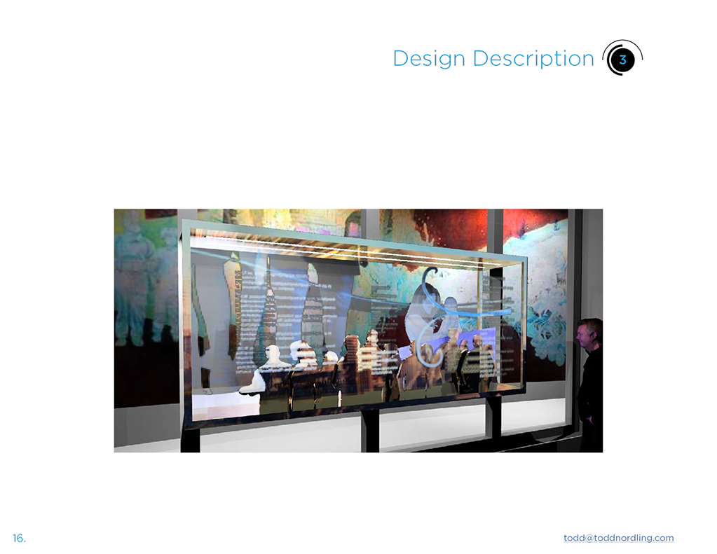
The third display case features the Donors in line with the mural content. Materials of engraved brass and figures allow for artifacts and photos to be included. Text tells the story of how donor and donor groups have been at the heart of SCRI’s community, and switchable glass or front lit color changing allows for the viewer’s face to be included in the community upon triggering a lighting change.
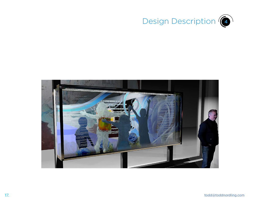
The fourth display features the immunotherapy patients, in line with those in the mural, happy healthy children for whom immunotherapy has performed miracles. An interactive element in this case launches a short video clip of the immunotherapy at work on the surface of a patient made of projectable surfaces and transclucet materials. Viewers see the amazing footage of T cells destroying the cancer cells, which provides a powerful conclusion to the story of immunotherapy and the focus of Building Cure.